- Define
chartobjects - Learn about methods specific to chart objects
- plot a chart for example DatasetExperiment and model objects
Module 7 Chart objects
7.1 The chart template
The chart template provides a mechanism to generate standardised graphics for input objects. Most frequently charts are designed for DatasetExperiment objects and specific model objects, like PCA.
7.1.1 chart methods
The chart template defines a key method for all charts: chart_plot.
This method defines the chart to be plotted. Like for model objects, this method is provided by extending the chart template. For example, the pca_scores_plot chart object provides a chart_plot method that takes a PCA object as input and generates a PCA scores plot from it.
# prepare chart object
C = pca_scores_plot(factor_name = 'Species')

# plot chart C for model M
chart_plot(C,M)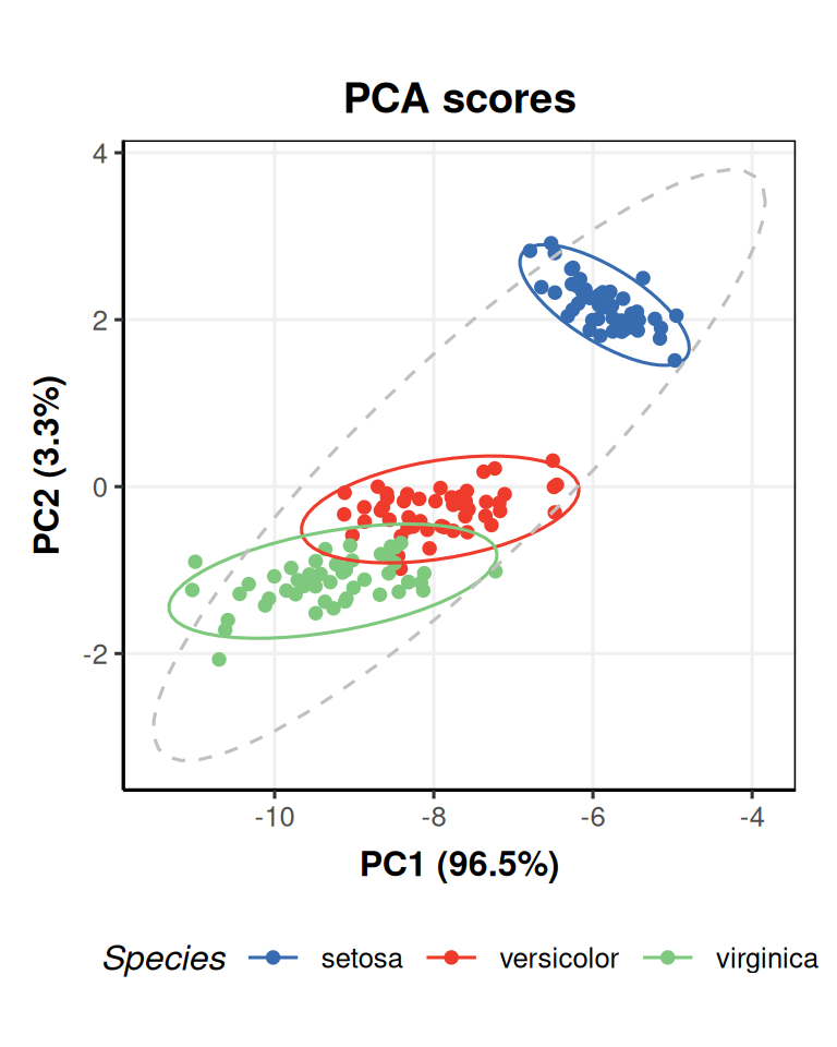
The factor_name input specifies a column of the sample_meta data from the iris dataset to use as a basis for colouring the groups in the plot.
The scores being plotted are formatted as a DatasetExperiment object, and the meta data has been inherited from the input data (iris data in this case).
You could use the scatter_chart object with M$scores as the second input for chart_plot to obtain a similar plot.
# prepare chart
N = scatter_chart(factor_name = 'Species')
# plot chart N for scores of M
chart_plot(N,M$scores)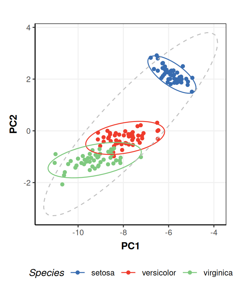 The advantage of using an object specific chart (like
 pca_scores_plot) is that the chart can automatically include outputs that require the input objects to calculate (like percent variance for PCA), which you would otherwise have to calculate and add to the plot manually.
7.2 Modifying charts
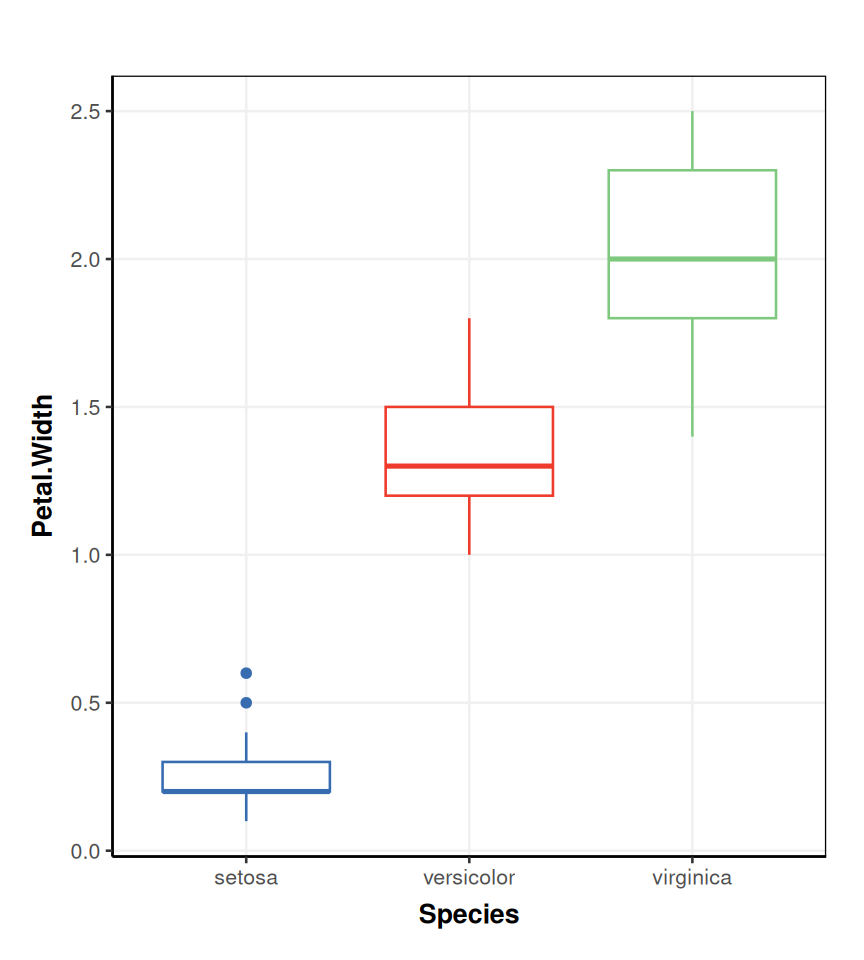
Charts can be defined for any input object, not just models. For example, the DatasetExperiment_factor_boxplot chart generates a boxplot for a named column of a DatasetExperiment object. Here, we use it to generate a boxplot of the Petal.Width column and separate/colour the boxes according to the Species factor.
# prepare chart object
C = DatasetExperiment_factor_boxplot(
        feature_to_plot = 'Petal.Width',
        factor_names = 'Species')

# plot C for iris data
chart_plot(C,iris_DatasetExperiment())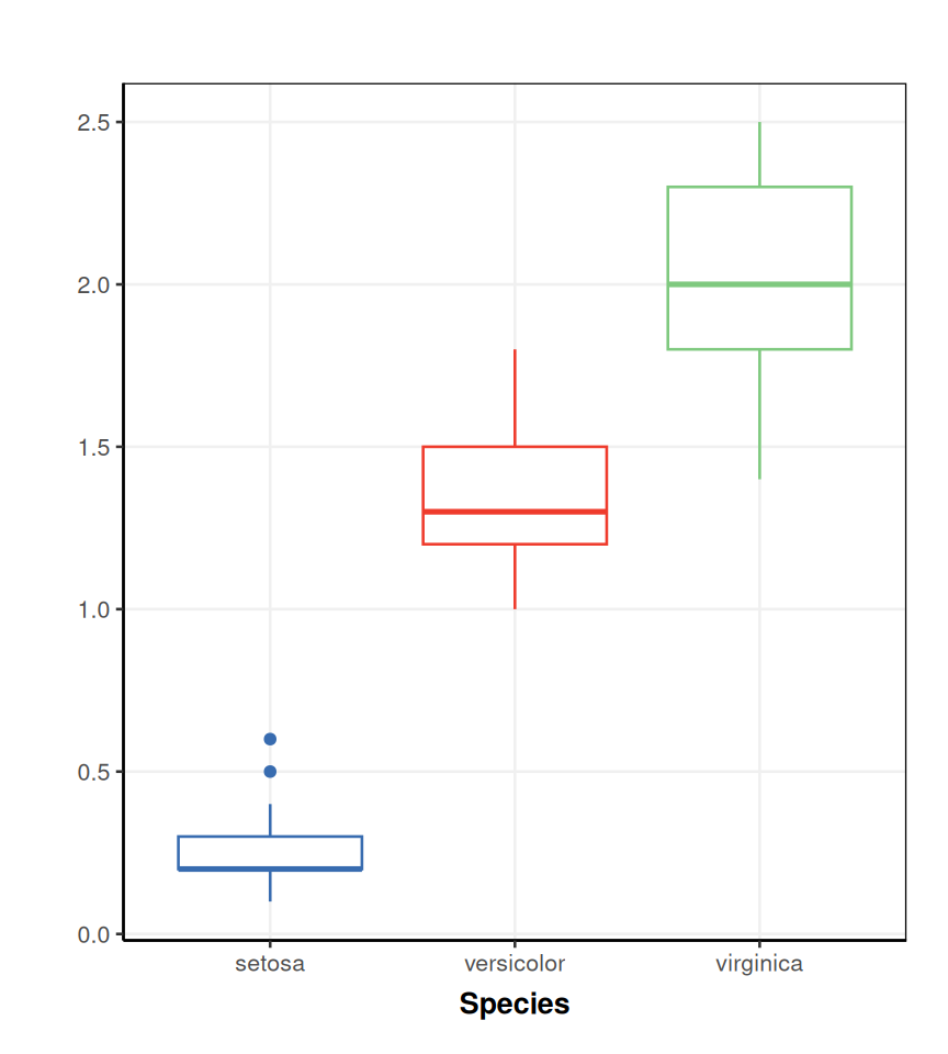
Sometimes, you will want to make changes to the plot, such as adding titles, axis labels, legend position, etc. The output for all chart objects is a ggplot object, so you can add to it after the chart_plot call. For example, here we add the missing y-axis label.
If you want to make more complex changes, or generate your own plots, then you will need to e.g. use ggplot and extract data from the objects yourself. If you use the chart a lot, consider wrapping it into a new chart object; refer to the struct package vignettes here if you are interested in how to do this.
7.3 Exercise
PCA scores plot for MTBLS79 data
In this exercise you will use chart objects to explore the effects of processing on the MTBLS79 dataset. Use the default inuts for each object unless pecified.
- Import the filtered MTBLS79 data into your workspace
- Apply knn imputation (5 neighbours) to replace missing values, mean centre the data, and then apply PCA (at least 4 components).
- Create a PCA scores plot from the PCA object. Plot using the
Classfactor.- for components 1 and 2
- for components 3 and 4
- Use the
mv_boxplotobject, with the settings below, and plot it for the data before and after knn imputation. What can you say about the features after imputation?- Do not plot by sample.
- Do not label outliers.
- Plot using the
Classfactor.
- Use the
DatasetExperiment_factor_boxplotchart to examine the feature labelled"300.12775"before and after mean centring. Add the missing y-axis labels and a title using ggplot. What has mean centring done to the data? Check by plotting some of the other features.- Plot using the
Classfactor.
- Plot using the
- Make sure you have activated the
ggplot2library. - Useful model objects:
knn_impute,mean_centre,PCA. - Useful chart objects:
pca_scores_plot,mv_boxplot,DatasetExperiment_factor_boxplot. - Useful ggplot functions:
ylab,ggtitle
The data can be imported exactly as we did for Module 5.
Apply each model one at a time, using the
predictedmethod to get the data after each step.We can select the components to plot using the
xcolandycolinputs to thepca_scores_plotobject. Note that this object requires a PCA object as input tochart_plot.# prepare chart object C1 = pca_scores_plot(xcol = 1, ycol=2, factor_name = 'Class') # plot for PCA object chart_plot(C1,P)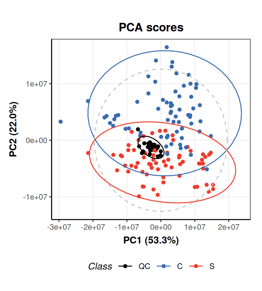
# prepare chart object
C2 = pca_scores_plot(xcol = 3, ycol=4, factor_name = 'Class')
# plot for PCA object
chart_plot(C2,P)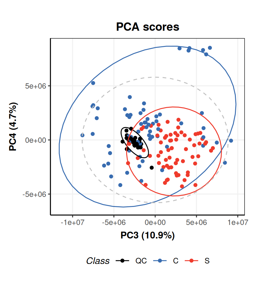
We can access the data after imputation using the
predictedmethod. Note that we can use the same chart object, and plot it with different input data. We add titles using theggtitlefunction.# prepare object C = mv_boxplot( by_sample = FALSE, label_outliers = FALSE, factor_name = 'Class' ) # plot before imputation chart_plot(C,DE) + ggtitle('Before imputation')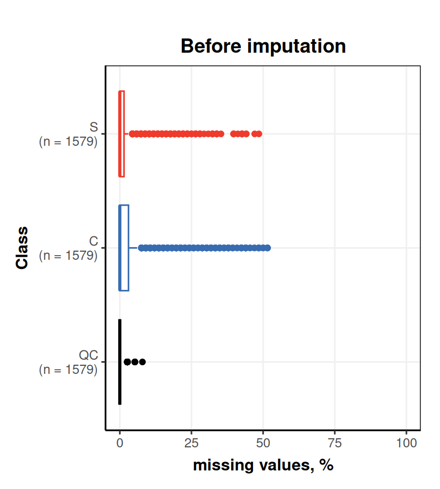
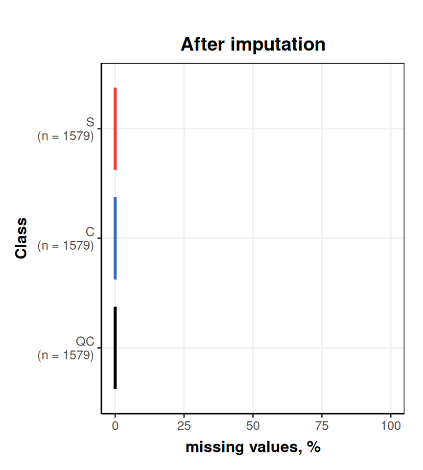 The plots show that no features have missing values after imputation; imputation has replaced them all with an estimated value.
Mean centring sets the mean value of a feature equal to zero. You can see this by examining the change in the y-axis of the plots before and after.
# prepare chart
C = DatasetExperiment_factor_boxplot(
        feature_to_plot = "300.12775",
        factor_name = 'Class')
# plot before
# note that the imputed data was used as input to mean centring, so we use that here
chart_plot(C,predicted(K)) +
    ggtitle('Before mean centring') +
    ylab('300.12775')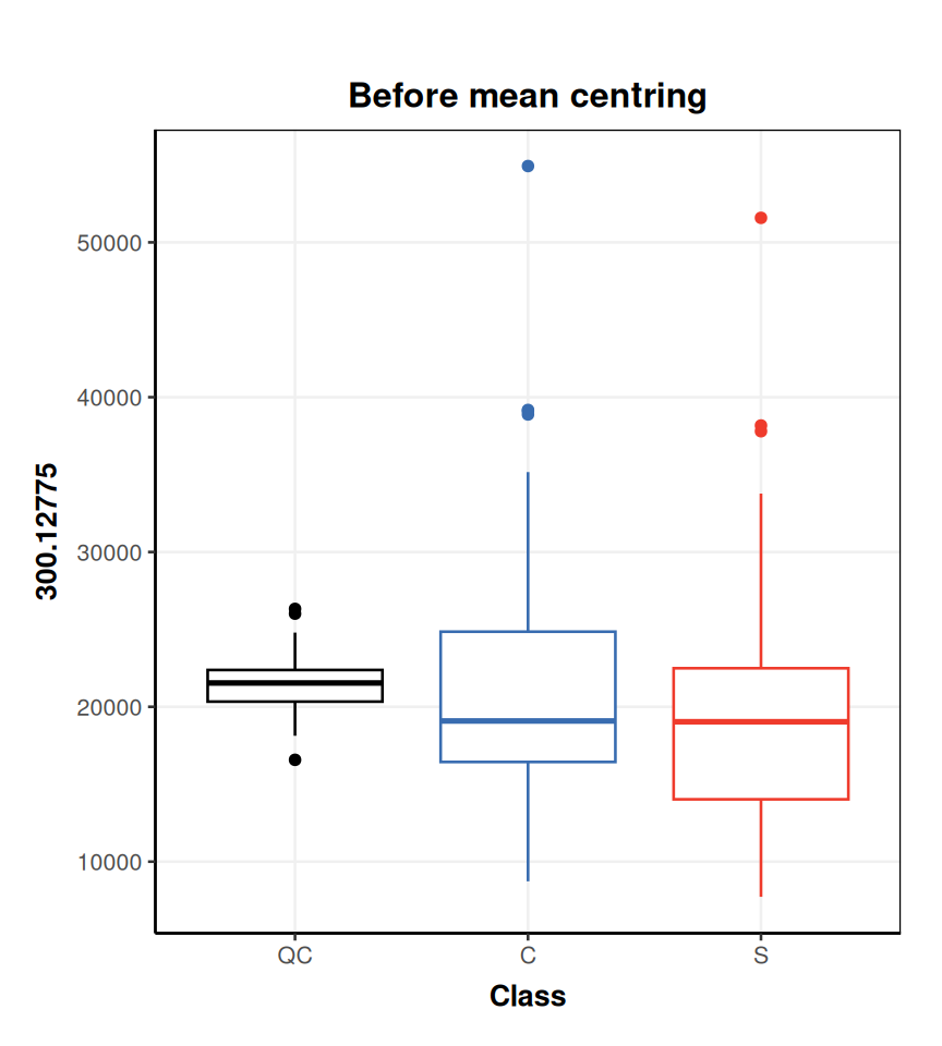
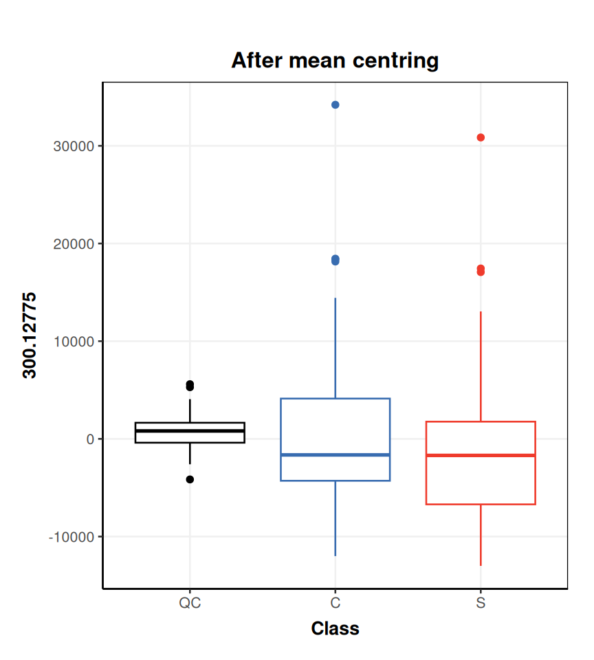 Mean centring is applied to all features, so any feature you choose will show the same effect. You can list the names of features for a
 DatasetExperimentusing thecolnamesfunction:Alternatively the
DatasetExperiment_factor_boxplotobject accepts a column index as input (i.e.feature_to_plot = 1instead offeature_to_plot = "70.03364"will produce the same plot).