- Describe the model sequence (
model_seq) template - Create and use model sequences to implement a workflow
- Access individual workflow steps
- Apply a model sequence to an example dataset
Module 8 Model sequences
8.1 The model_seq template
The purpose of the model sequence template is to allow you to chain together model objects into a workflow (or sequence) and then apply the entire sequence to a dataset in a single step.
In Modules 6 and 7 you will have applied several models in a row through multiple uses of model_apply, and passing the output data from one model into the next using the predicted method. Model sequences can do this for you.
We can create a model sequence by “adding” models to the sequence. For example, it is common practice to mean centre before PCA.
A model_seq object containing:

[1]
A "mean_centre" object
----------------------
name:          Mean centre
description:   The mean sample is subtracted from all samples in the data matrix. The features in the centred
                 matrix all have zero mean.
input params:  mode
outputs:       centred, mean_data, mean_sample_meta
predicted:     centred
seq_in:        data

[2]
A "PCA" object
--------------
name:          Principal Component Analysis (PCA)
description:   PCA is a multivariate data reduction technique. It summarises the data in a smaller number of
                 Principal Components that maximise variance.
input params:  number_components
outputs:       scores, loadings, eigenvalues, ssx, correlation, that
predicted:     that
seq_in:        data
If you are familiar with ggplot, then adding models to a sequence is similar to adding layers to a plot. When models are added together they automatically become a model_seq object.
[1] "model_seq"8.2 Applying model sequences
When model_apply is used with a model sequence, the data is input into the first model of the sequence. That model is applied to the data, and then the output of the model is used as the input to the next model. For our PCA example this means that the data is mean centred, and the then the mean centred data is used as input to PCA.
The output of a model object is specified by the pred slot, which names the output slot used as input to the next model in a sequence. This should always be a DatasetExperiment object, or the model sequence will fail.
The name of output data from a model can be displayed using the predicted_name function.
[1] "centred"chart objects cannot be used in a model sequence.
8.3 Indexing steps in a sequence
Formally, model steps in a sequence are stored in a list of the model_seq object. You can access it using models method. However, it often easier to access individual steps through the use of indexing. For example, the first model of the sequence can be extracted using square brackets:
A "mean_centre" object
----------------------
name:          Mean centre
description:   The mean sample is subtracted from all samples in the data matrix. The features in the centred
                 matrix all have zero mean.
input params:  mode
outputs:       centred, mean_data, mean_sample_meta
predicted:     centred
seq_in:        data
If the model sequence has been trained (or applied) then the indexed model will contain all outputs for that step in the sequence. This is useful if e.g. we want to produce plots and charts for the data and objects at different stages of a workflow.
# prepare a plot
C = DatasetExperiment_factor_boxplot(
        feature_to_plot = 1,
        factor_names = 'Species')

# get mean centered data from first model step
DEmc = predicted(MS[1])

# plot C for the data mean centred data
chart_plot(C,DEmc)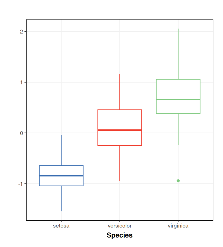
This approach also means that all steps are available after applying the workflow. We can therefore branch off from the workflow at any point and use the partly processed data as input into a different sequence, for example. We can also keep a record of all processing steps, and explore their impact on the data. This comes at the cost of higher computation resources required to store all of the results and pass then between methods.
8.4 Exercise
Model sequences
In this exercise you will construct a workflow, apply it to some data and then generate some plots for the different steps. You will create a number of models that might be unfamiliar to you. Don’t worry if you dont know what these steps are yet, the idea is to give you practice using model sequences; details of the steps used are not critical for this exercise.
Use the default input values for objects unless specified.
- Import the filtered MTBLS79 dataset.
- Create a model sequence with the following steps (in order) and print a summary of the sequence you have created to the console:
- Normalise the data using the
pqn_normobject. Use the following inputs:ref_method = "mean"factor_name = "Class".
- Impute missing values using kNN imputation with 5 neighbours.
- Mean centre the data
- Apply PCA (at least 2 components)
- Normalise the data using the
- What output of the second step in your sequence is used as the input to the third step?
- Use indexing to compare a
tic_plotof the data before and after applying the PQN step of the workflow. What do you notice about the QC samples? For thetic_plotobject use the following inputs:run_order = "run_order"connected = TRUE
- Apply PCA after the imputation step, and compare the PCA scores plot to your original workflow.
- Useful models:
pqn_norm,knn_impute,mean_centre,PCA - Useful charts:
tic_plot,pca_scores_plot - Useful methods:
model_apply,predicted,predicted_name - Use indexing to access steps of a sequence for models you have already created
- Dont foret to apply your sequence to the data before generating plots
- Add titles etc to your plots if you want to
The data can be imported exactly as we did for Module 5.
Create a model sequence by “adding” multiple models together. We can create a summary using
show.# prepare model sequence MS = pqn_norm( factor_name = "Class", ref_method = "mean") + knn_impute( neighbours = 5) + mean_centre() + PCA( number_components = 2) # print to console show(MS)A model_seq object containing: [1] A "pqn_norm" object ------------------- name: Probabilistic Quotient Normalisation (PQN) description: PQN is used to normalise for differences in concentration between samples. It makes use of Quality Control (QC) samples as a reference. PQN scales by the median change relative to the reference in order to be more robust against changes caused by response to perturbation. input params: qc_label, factor_name, qc_frac, sample_frac, ref_mean, ref_method outputs: normalised, coeff, computed_ref, ref_count, sample_count, coef_count, coef_idx, coef_name predicted: normalised seq_in: data [2] A "knn_impute" object --------------------- name: kNN missing value imputation description: k-nearest neighbour missing value imputation replaces missing values in the data with the average of a predefined number of the most similar neighbours for which the value is present input params: neighbours, feature_max, sample_max, by outputs: imputed predicted: imputed seq_in: data [3] A "mean_centre" object ---------------------- name: Mean centre description: The mean sample is subtracted from all samples in the data matrix. The features in the centred matrix all have zero mean. input params: mode outputs: centred, mean_data, mean_sample_meta predicted: centred seq_in: data [4] A "PCA" object -------------- name: Principal Component Analysis (PCA) description: PCA is a multivariate data reduction technique. It summarises the data in a smaller number of Principal Components that maximise variance. input params: number_components outputs: scores, loadings, eigenvalues, ssx, correlation, that predicted: that seq_in: dataWe can use the
predicted_namemethod and indexing to obtain the name of the output of the second step in the sequence:[1] "imputed"We can create a single
tic_chartobject and then use it with different datasets to compare the outputs. We havent applied your sequence to any data yet, so we do it now.# apply model sequence MS = model_apply(MS,DE) # prepare chart object C = tic_chart( run_order = 'run_order', factor_name = 'Class', connected=TRUE) # plot for raw input data chart_plot(C,DE)Warning: `aes_string()` was deprecated in ggplot2 3.0.0. ℹ Please use tidy evaluation idioms with `aes()`. ℹ See also `vignette("ggplot2-in-packages")` for more information. ℹ The deprecated feature was likely used in the structToolbox package. Please report the issue to the authors. This warning is displayed once per session. Call `lifecycle::last_lifecycle_warnings()` to see where this warning was generated.Warning: Using `size` aesthetic for lines was deprecated in ggplot2 3.4.0. ℹ Please use `linewidth` instead. ℹ The deprecated feature was likely used in the structToolbox package. Please report the issue to the authors. This warning is displayed once per session. Call `lifecycle::last_lifecycle_warnings()` to see where this warning was generated.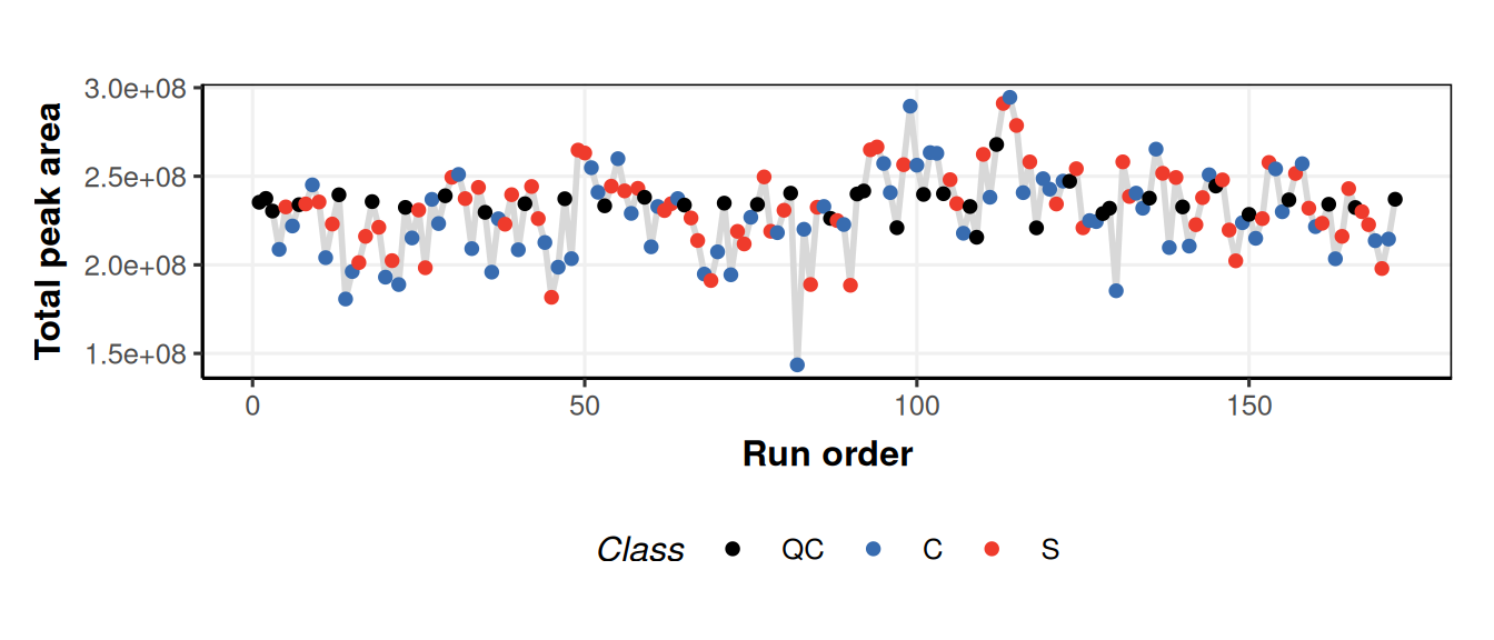
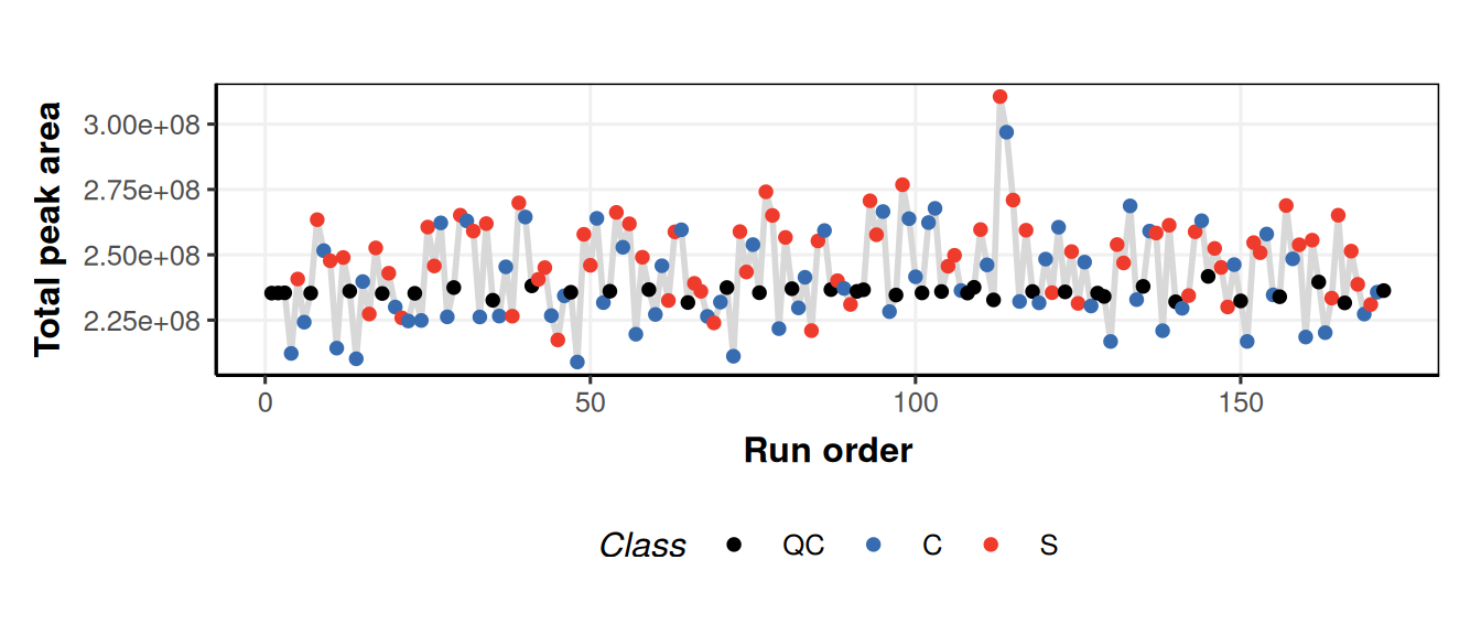
We used
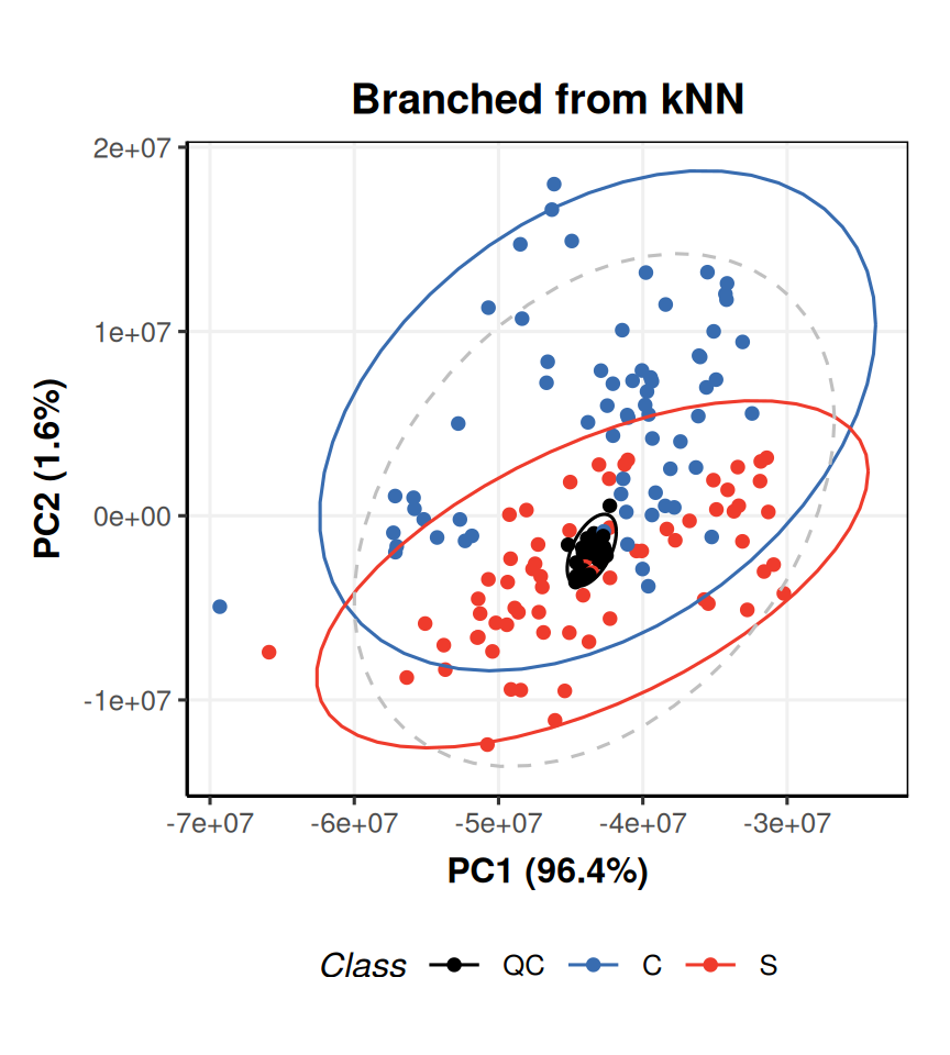
predictedand indexing to get the data after normalisation. After normalisation the QCs have more similar total peak area because differences in concentration have been accounted for by the normalisation.We can use indexing to apply a new PCA model to the output of the kNN step, and then generate a PCA plot for each PCA object.
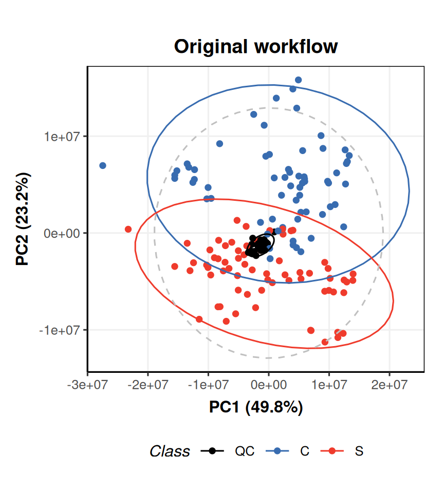
# new PCA object
P = PCA(number_components = 2)

# apply to imputed data from model sequence
P = model_apply(P,predicted(MS[2]))

# prepare chart
C = pca_scores_plot(factor_name = 'Class')

# plot for original workflow PCA
chart_plot(C,MS[4]) + ggtitle('Original workflow')